

Page Builder Studio Overview
WaanKit's Page Builder is a visual, drag-and-drop editor designed for assembling responsive smartphone landing pages, link-in-bio hubs, promotional micro-sites, and feedback surveys without writing code.
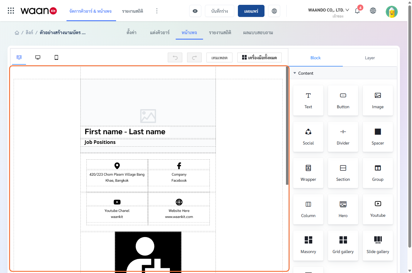
1. Starting with Template Themes
When creating a new landing page, you can choose from categorized pre-designed themes:
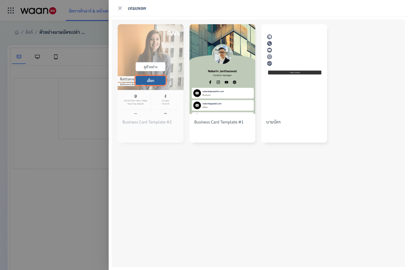
- Filter themes by industry (Corporate, Creative, Retail, Technology, Personal, Food, Research, Registration, Poll, Order).
- Click "Preview" to inspect mobile interactions.
- Click "Select" to adopt the template structure into the canvas editor.
2. Canvas Toolbar & Controls
The top toolbar manages viewport previews, revision history, and publication states:
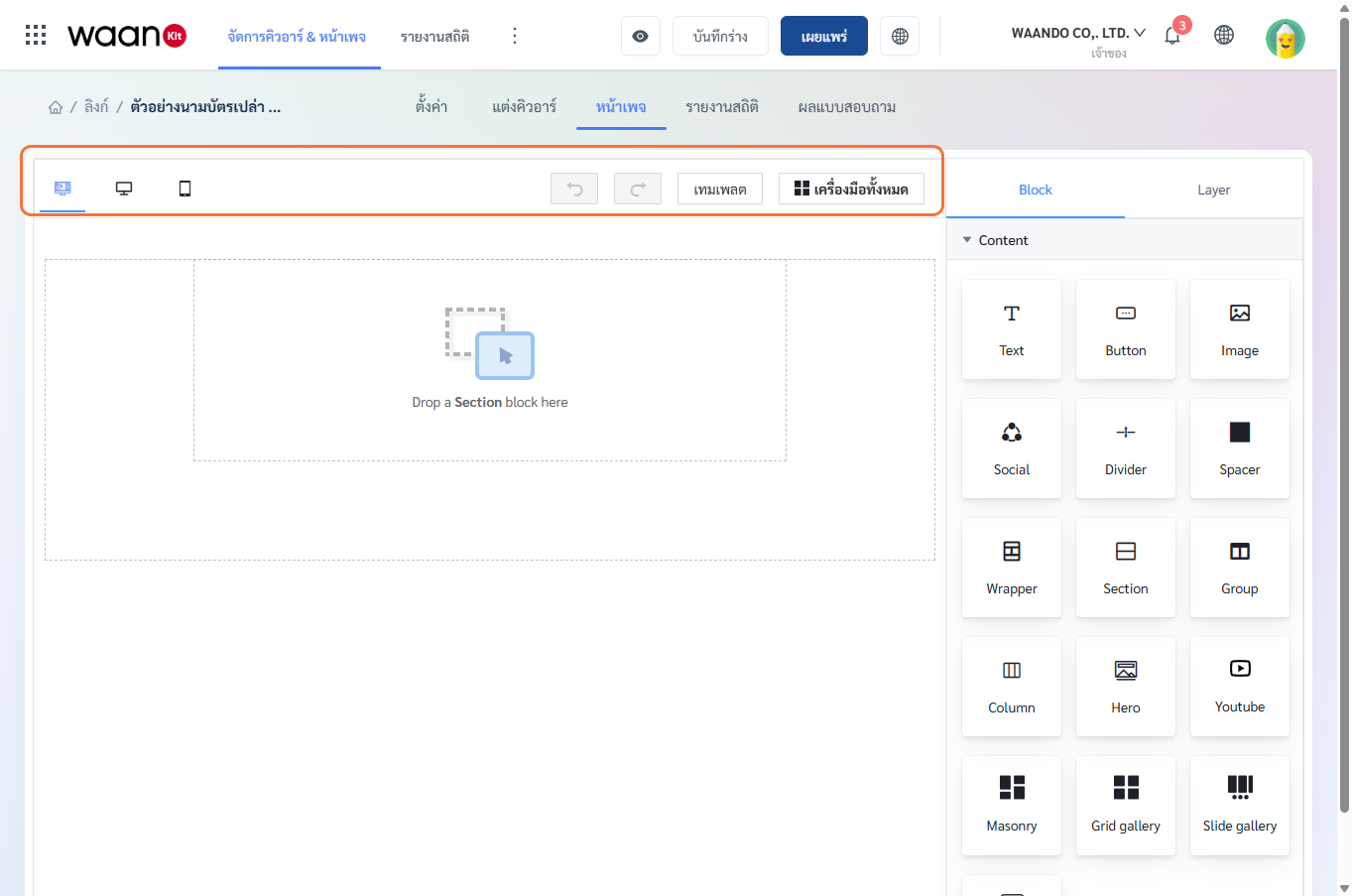
2.1 Viewport Switchers
- Desktop Mode: Checks layout scaling on wide displays.
- Tablet Mode: Simulates tablet viewport proportions.
- Mobile Mode: Standard smartphone viewport for mobile-first landing pages.
2.2 History Controls
- Undo: Reverts the previous edit action.
- Redo: Restores a reverted edit action.
2.3 Publication & Action Buttons
- Preview: Opens an interactive modal to test links and forms.
- Save Draft: Saves changes internally without altering the live version.
- Publish: Pushes updates live to the public URL immediately.
- Public URL: Opens the live landing page in a new browser tab.
3. Block Library & Element Categories
The right-side sidebar organizes available components into specialized trays:
3.1 Content & Multimedia Blocks
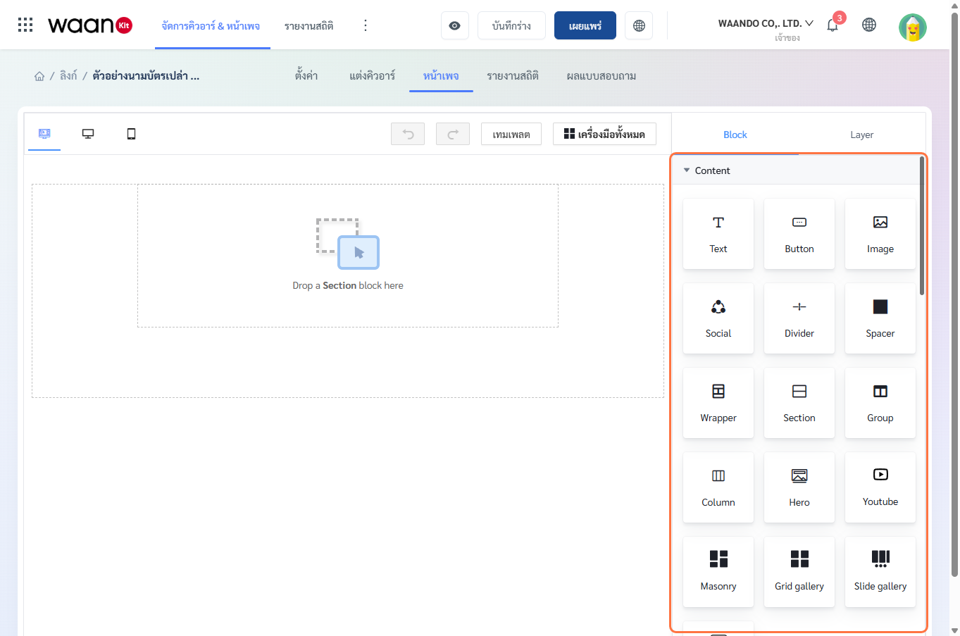
- Text: Rich text blocks with font sizes, alignments, colors, and hyperlinks.
- Button: Call-to-Action buttons for external URLs, phone calls, emails, or LINE chat.
- Image: Header banners, product photos, and company logos.
- Social: Social media icon ribbons (Facebook, Instagram, YouTube, LINE, X/Twitter).
- Divider: Horizontal dividing lines.
- Spacer: Vertical whitespace adjustments.
- Wrapper / Section / Group / Column: Structural layout containers.
- Hero: Prominent header banner with headline text.
- YouTube: Embedded streaming videos via video URL.
- Masonry: Multi-column dynamic grid image gallery.
- Grid Gallery: Structured matrix image grid.
- Slide Gallery: Auto-scrolling and swipeable image carousels.
3.2 Layout & Column Grids
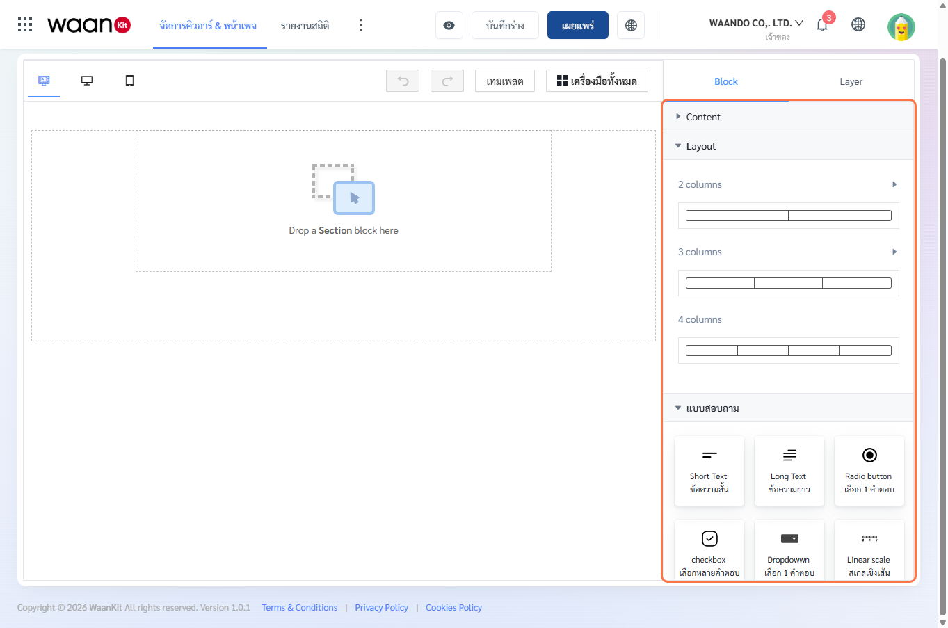
- 2 Columns: Split widths including
50%:50%,33%:67%,67%:33%,25%:75%,75%:25%. - 3 Columns: Multi-column widths such as
33.33%:33.33%:33.33%,25%:25%:50%,50%:25%:25%. - 4 Columns: Symmetrical 4-quadrant layout
25%:25%:25%:25%.
3.3 Questionnaire & Feedback Form Blocks
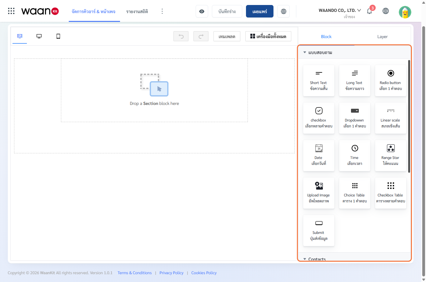
| Block Name | Functionality | Common Use Case |
|---|---|---|
| Short Text | Single-line text input | Customer full name, phone number, member ID |
| Long Text | Multi-line text area | Suggestions, problem description, delivery address |
| Radio Button | Single-choice selection | Gender, age range, target department |
| Checkbox | Multi-choice selection | Products of interest, event participation |
| Dropdown | Compact dropdown menu | Store branch selection, province |
| Linear Scale | Numerical rating scale (1-5 or 1-10) | Service quality assessment |
| Date | Date picker calendar | Appointment date, date of birth |
| Time | Time picker clock | Preferred contact callback window |
| Range Star | 1 to 5 star rating scale | Product satisfaction score |
| Upload Image | File upload box | Payment receipt slip, damaged item photo |
| Choice Table | Single-choice question matrix | Multi-attribute service evaluation |
| Checkbox Table | Multi-choice matrix grid | Multi-dimensional interest survey |
| Submit Button | Form submission trigger | Submits response data with instant Telegram Bot alerts |
[!NOTE] Viewing Form Responses: All survey submissions are logged automatically under the "Survey Results" tab of the corresponding Smart Link.
3.4 Business Card & Contacts Blocks
Specialized dynamic blocks available when designing Digital Business Cards:
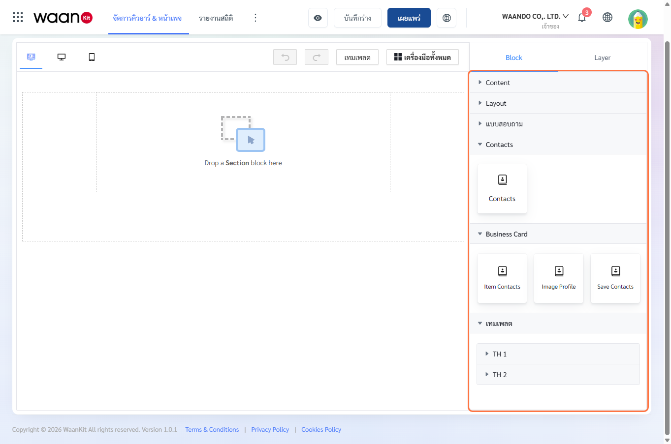
- Contacts: Unified multi-channel contact badge block.
- Item Contacts: Dynamic staff contact data badges (phone, email, social links).
- Image Profile: Profile portrait photo with theme-styled frames.
- Save Contacts: Single-click vCard (
.vcf) download button for smartphone address books.
4. Layer Tree & Hierarchy Management
Switch to the Layer tab in the top-right toolbar to view the document object tree:
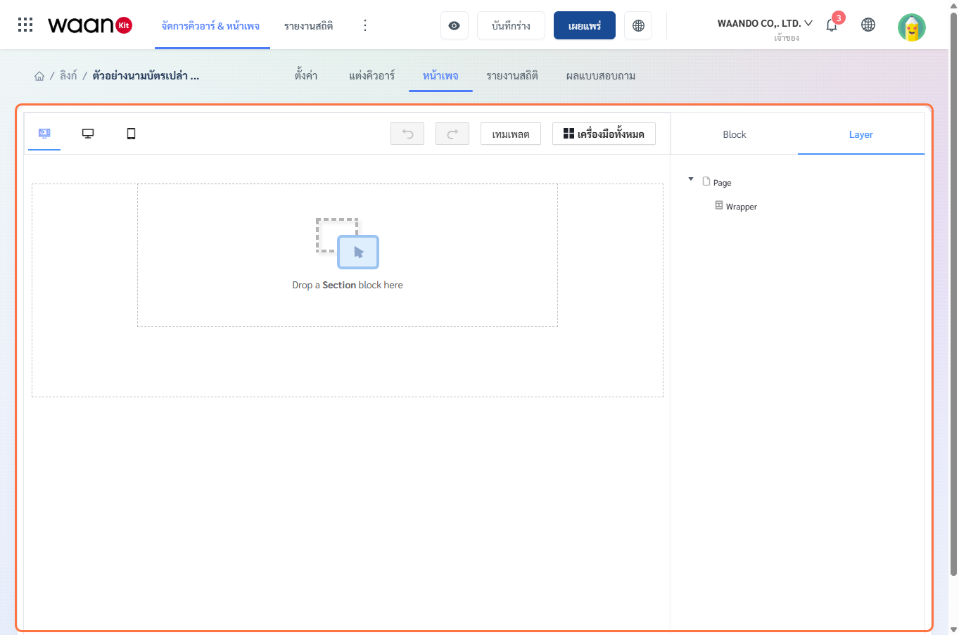
- Tree Hierarchy: Displays the container nesting from
Page > Wrapper > Section > Column > Block. - Drag to Reorder: Drag layer items vertically to rearrange layout stacking order.
- Select & Inspect: Click any layer node to open its properties inspector.
5. Workflow Summary
- Select Template or Define Structure: Choose a pre-built template or drag
SectionandColumngrids onto the canvas. - Add Content & Media: Populate columns with
Text,Image,Button,Social, orYouTubeblocks. - Customize Styling: Configure background colors, margins, padding, and typography.
- Preview & Publish: Test across viewports using Preview, then click Publish to deploy changes immediately.